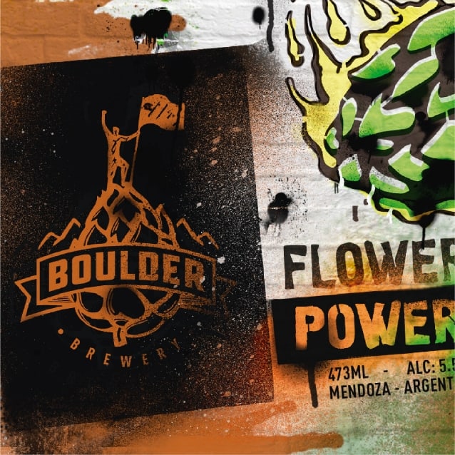
For this project, a comprehensive visual identity was created to capture the essence of the venture. The brand is inspired by an activity cherished by the founders: bouldering.
Drawing from this passion, a visual metaphor was devised where a person climbs over hops instead of rock, reflecting the personal journey of these friends in bringing this project to life.
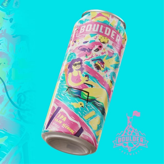
Five distinct labels were designed for each of the beer varieties, each with a unique concept reflecting its particular characteristics.
Origin: 🇦🇷
Para este proyecto, se creó una identidad visual integral que captura la esencia del emprendimiento. La marca está inspirada en una actividad muy apreciada por los fundadores: boulder.
A partir de esta pasión, se ideó una metáfora visual donde una persona escala sobre lúpulo en lugar de roca, reflejando el viaje personal de estos amigos para llevar a cabo este proyecto.
Se diseñaron cinco etiquetas distintas para cada una de las variedades de cerveza, cada una con un concepto único que refleja sus características particulares.
Origen: 🇦🇷
23:59
Golden Ale
Due to its lightness, it encourages you to take a break and enjoy a lighter sensation throughout the day.
Fire in the Keg
American Amber Ale
Its red color represents fire, symbolizing the inner spark that kindles your determination and ambition.
Flower Power
IPA
Due to its distinctive flavors and aromas, it tantalizes your senses, bursting through the air like hop bombs.
Dark Necessities
Oatmeal Stout
It encourages you to explore your deepest desires, finding a harmonious balance between the light and darkness within you.
Pelopinch Fest
Low alcohol IPA
It’s an IPA with low alcohol content, perfect for summer sipping. So light that you can enjoy more than one while still splashing around in the pool.