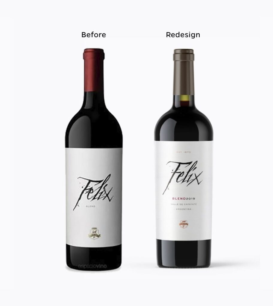
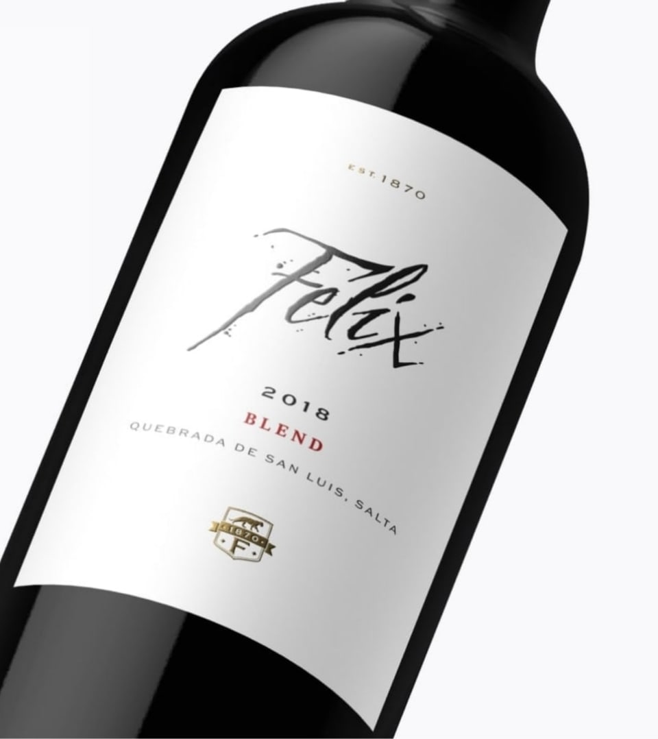
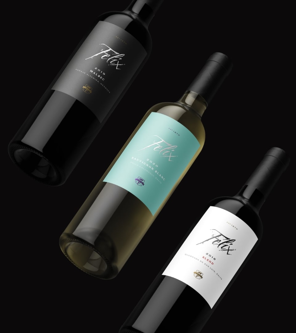
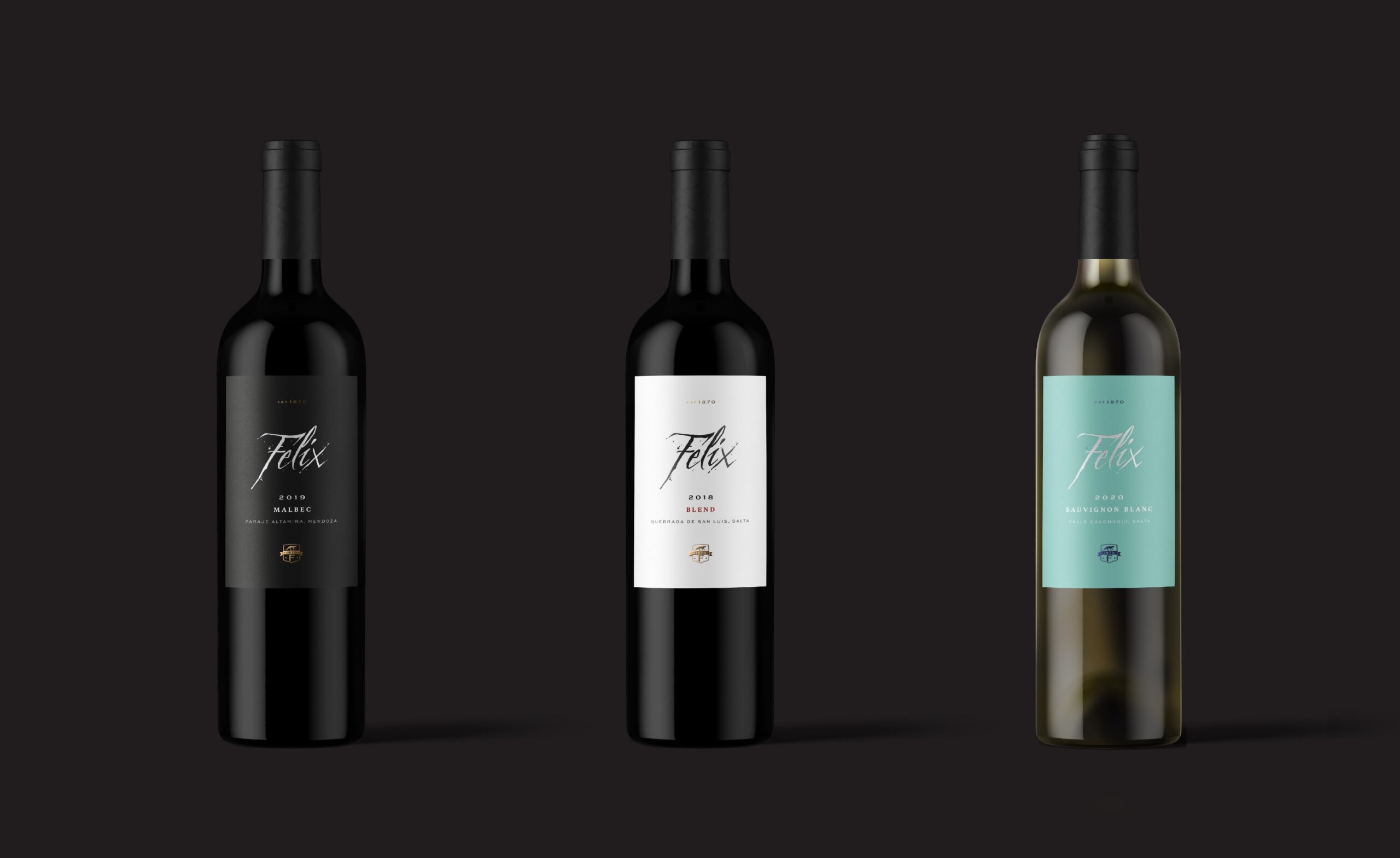
The name honors the great-grandfather of Pancho Lavaque, one of the three winemakers that make up Vallisto. Since this wine is a classic from the winery, the aim was to reinforce the idea of elegance, tradition, and family through a restyling.
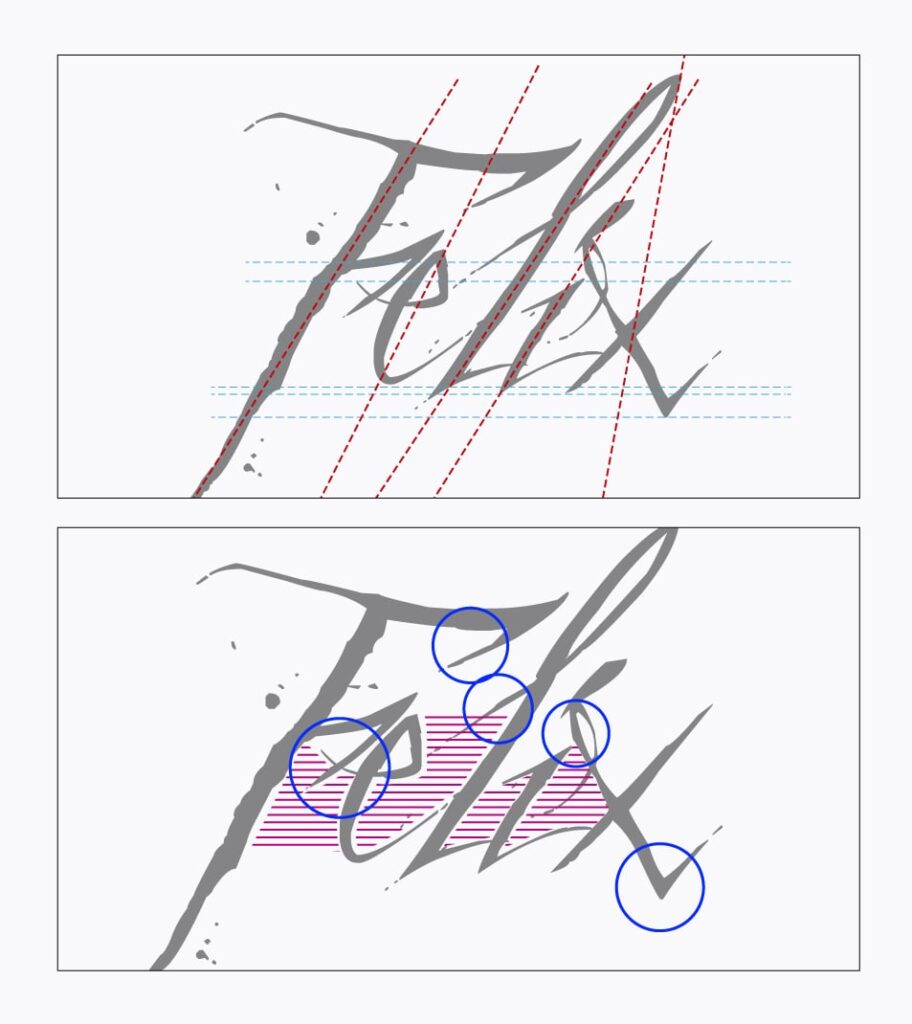
We began by conducting a thorough analysis of the existing design, including the typography slant, heights, spacings, and stylistic elements. Ultimately, we opted to preserve the irregular characteristics of the strokes and letter endings. We standardized the slant of the vertical strokes and removed certain stylistic elements to improve readability.
Origin: 🇦🇷
El nombre fue elegido en honor al bisabuelo de Pancho Lavaque, uno de los tres enólogos que integran Vallisto. Como este vino es un clásico de la bodega, se buscó reforzar la idea de elegancia, tradición y familia mediante un restyling.
Para empezar, realizamos un detallado análisis del diseño existente, tales como la inclinación de la tipografía, las alturas, los espaciados y los detalles estilísticos. Finalmente decidimos mantener los rasgos irregulares de los trazos y terminaciones de las letras. Regularizamos la inclinación de los trazos verticales y eliminamos algunos detalles estilísticos que dificultan su legibilidad.
Origen: 🇦🇷
Inclination
The letter strokes lack uniformity and parallel alignment, leading to issues with letter spacing.
Stylistic Details
The composition showcases stylistic strokes that give the letters personality, yet these details can introduce “noise” that affects the legibility of the design.
Height
The letters are randomly at different heights.
Spacing
The irregular inclination and varying heights of the letters result in inconsistent spacing throughout the composition.